Editorial Design
Our process
Feel free to judge a book by its design systems—not just its cover.
Editorial design is the thoughtful presentation of both written and visual content—think magazines, journals, books, newspapers, or any publication that tells a story. Print or digital.
Step back and you’ll see many systems at play: structure, typography, illustration, photography, color, and layout. Each element must work together seamlessly, creating a cohesive visual language that feels familiar yet distinctive, issue after issue.
Through art direction, we explore how these elements can support, echo, and enhance the content. We read, imagine, and experiment—over and over—seeking the best way to translate ideas onto the page or screen. Visual hierarchy, tone, and layout are carefully pushed, pulled, and refined on every spread, striking a balance between clarity and delight. Each publication is crafted to feel intentional, engaging, and unmistakably yours. In this kingdom, both content and design share the crown.

We begin by diving into your vision, audience, and goals. Understanding the tone, voice, and rhythm of your content informs every visual decision (because those cues shape every design decision that follows). Whether building from an existing publication or starting from scratch, we consider the structure and flow that will best serve the material—and keep readers turning the page.
Together, we study reference publications and design precedents, gathering inspiration and setting a clear direction. This is a time to think expansively on behalf of your readers—what do they want to hear, and how should it unfold on the page?
Next, we explore multiple approaches to layout, typography, graphic systems, and art direction. Pagination studies test different flows for the book, while conceptual cover designs and interior spreads explore a range of visual systems and tonal directions. Early explorations across each section help us understand how content and design interact on the page—and what feels worth lingering on.
This stage is playful, experimental, and abundant—variety first, refinement later (we make a lot so we can find the few that really sing).
With constructive feedback in hand, we refine, adjust, and sharpen through three rounds of proofing. Typography is fine-tuned, hierarchy clarified, imagery thoughtfully art directed, and layouts carefully balanced. We test readability, flow, and overall cohesion—making sure the design not only works, but feels good to spend time with.
At this stage, we also connect with our printing partners to gather pricing estimates, helping us steward both the process and the budget with care (and without surprises).
We review each spread to ensure every layout, in each section of the book, carries the original intent of the story—and that the details are checked (and checked again). After a final client review—confirming that even the last comma is in place—we prepare the book for press.
To bring the book to life, we partner with expert printers. We sample papers, write up estimates, review proofs, make final adjustments, and prepare each page for production. In some cases, we even visit the press—because the shift from screen to ink to paper is where the details really matter.
Great editorial design resonates beyond the page. It invites readers in, reflects the voice of the brand, and evolves alongside the content. Our goal is to create something that lasts—something to return to and pass along (to a fellow friend).
Related work

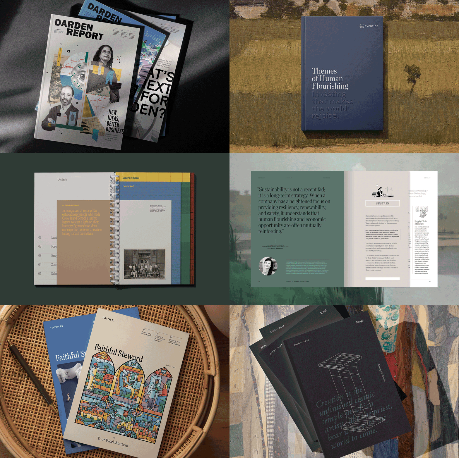
Darden Report
A magazine connecting students and alumni to emerging thought leadership at UVA Darden Business School
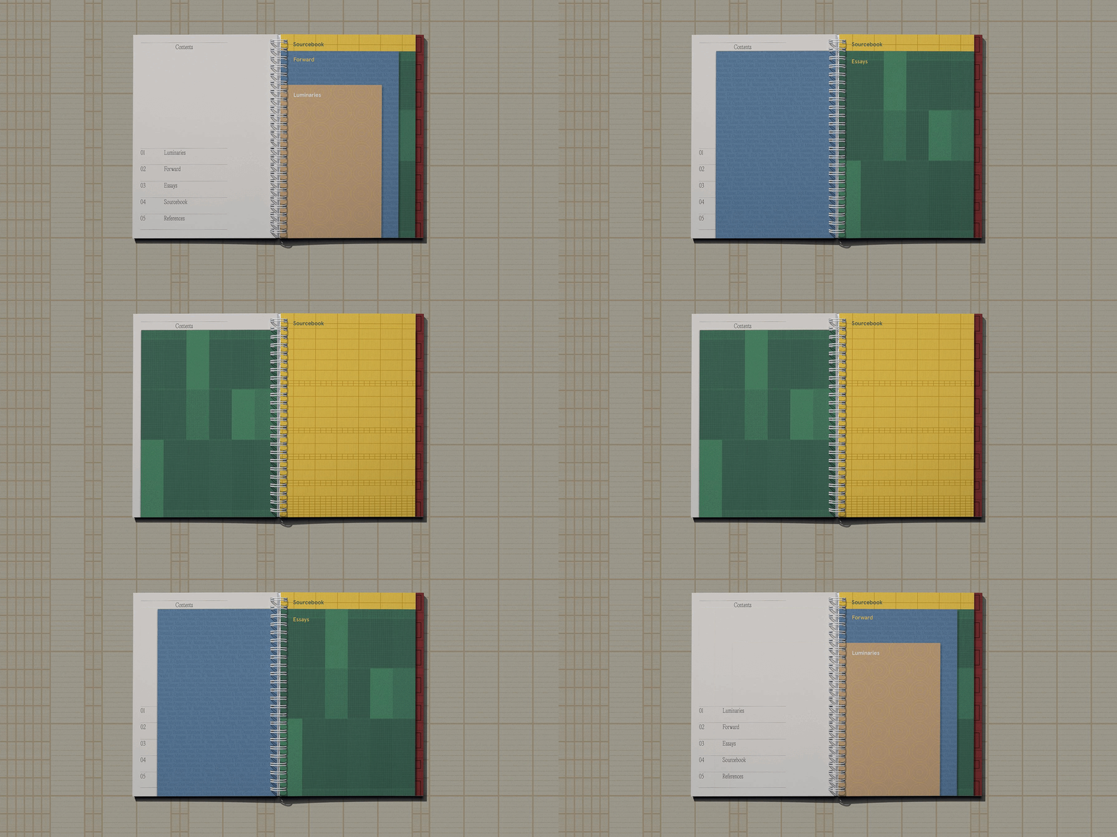
Crow Island School
Guiding the next generation at an iconic school celebrated for its progressive approach to design and early education
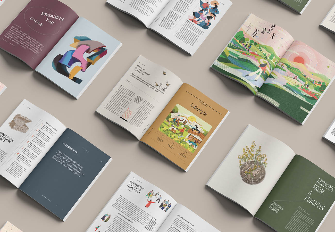
Faithful Steward
Guiding a community to thoughtfully integrate faith and finances
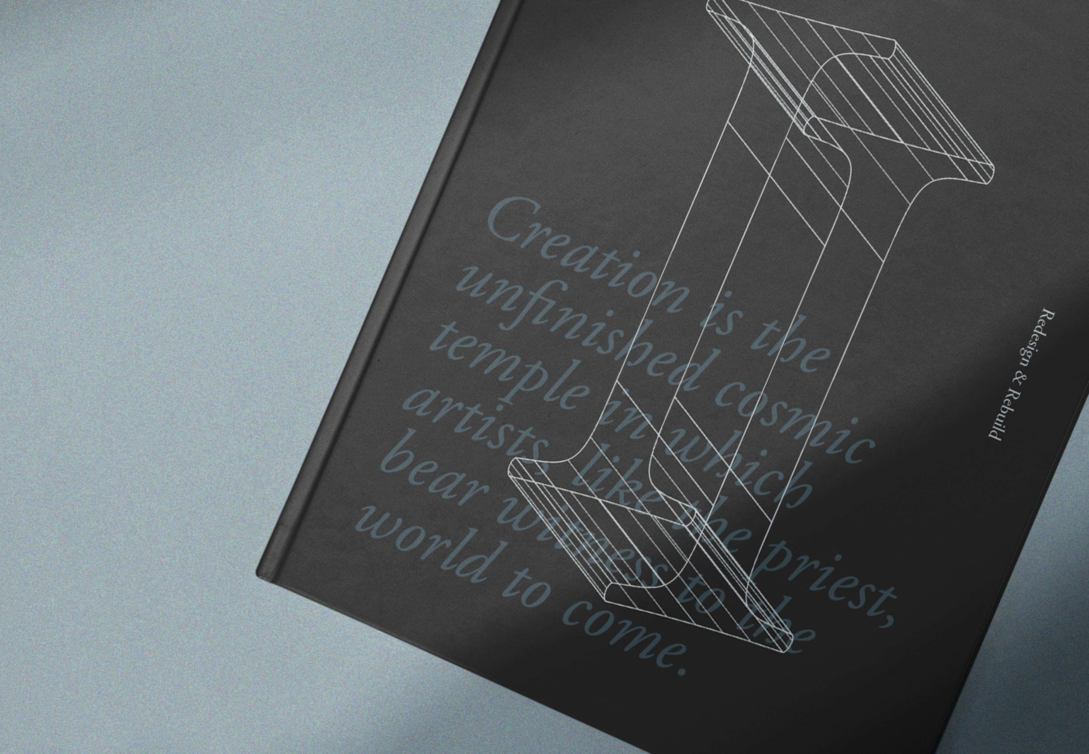
Image Fundraising
Cultivating a community of readers, artists, and writers that grapple with the mystery of being human
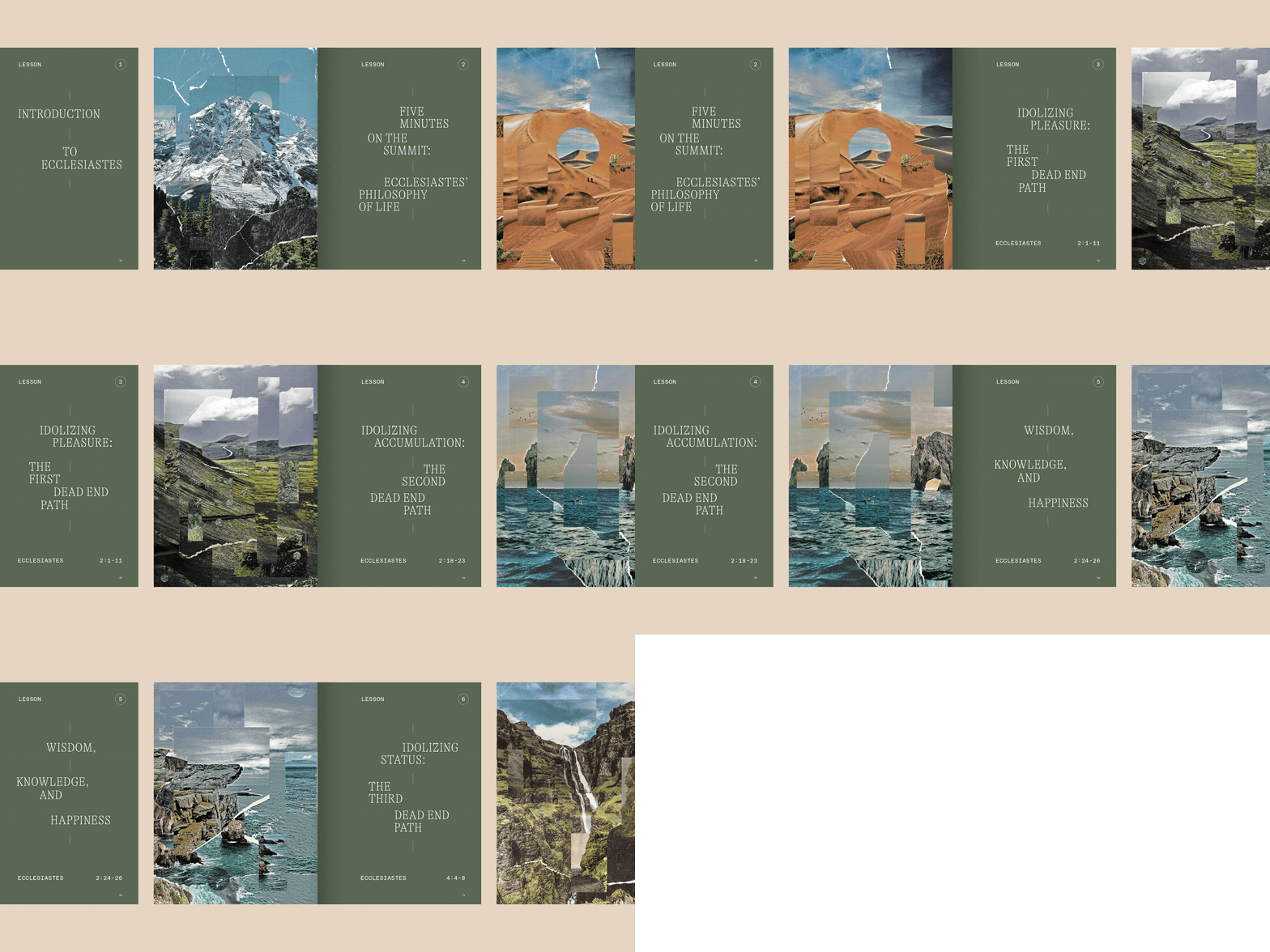
Wisdom Over Wealth
A book that explores the modern complexities of wealth